Gorka istina
Every TruthHas TwoSides. Every TruthHas TwoSides. Family Hospitality, Reimagined. Client Gorka Istina Year of the project 2026 Project duration 2…


At Aeon Studio, we believe in limitless possibilities shaped by clarity, balance, and refined simplicity. Our identity is built on principles of purpose, discipline, and meaningful design — values that guide every project we craft. From distinctive branding and thoughtful digital experiences to refined visual systems, our work reflects the philosophy we live and create by. Explore the essence of our brand, discover the structure behind our logo, and see how our vision comes to life.
View our brand →

At Aeon Studio, we believe in limitless possibilities shaped by clarity, balance, and refined simplicity. Our identity is built on principles of purpose, discipline, and meaningful design — values that guide every project we craft. From distinctive branding and thoughtful digital experiences to refined visual systems, our work reflects the philosophy we live and create by. Explore the essence of our brand, discover the structure behind our logo, and see how our vision comes to life.
View our brand →
Client
Hotel Emaus
Year of the project
2025
Project duration
6 months
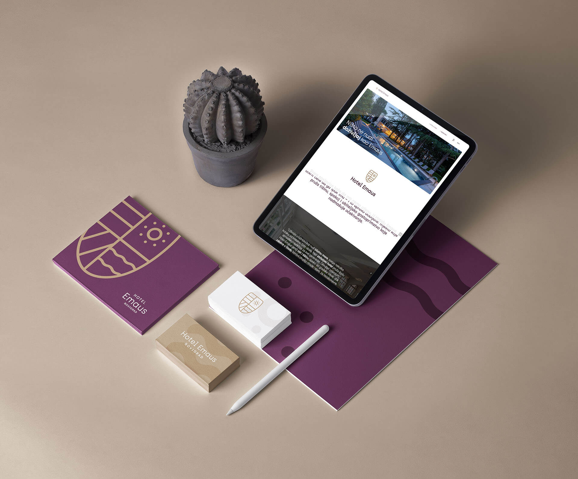
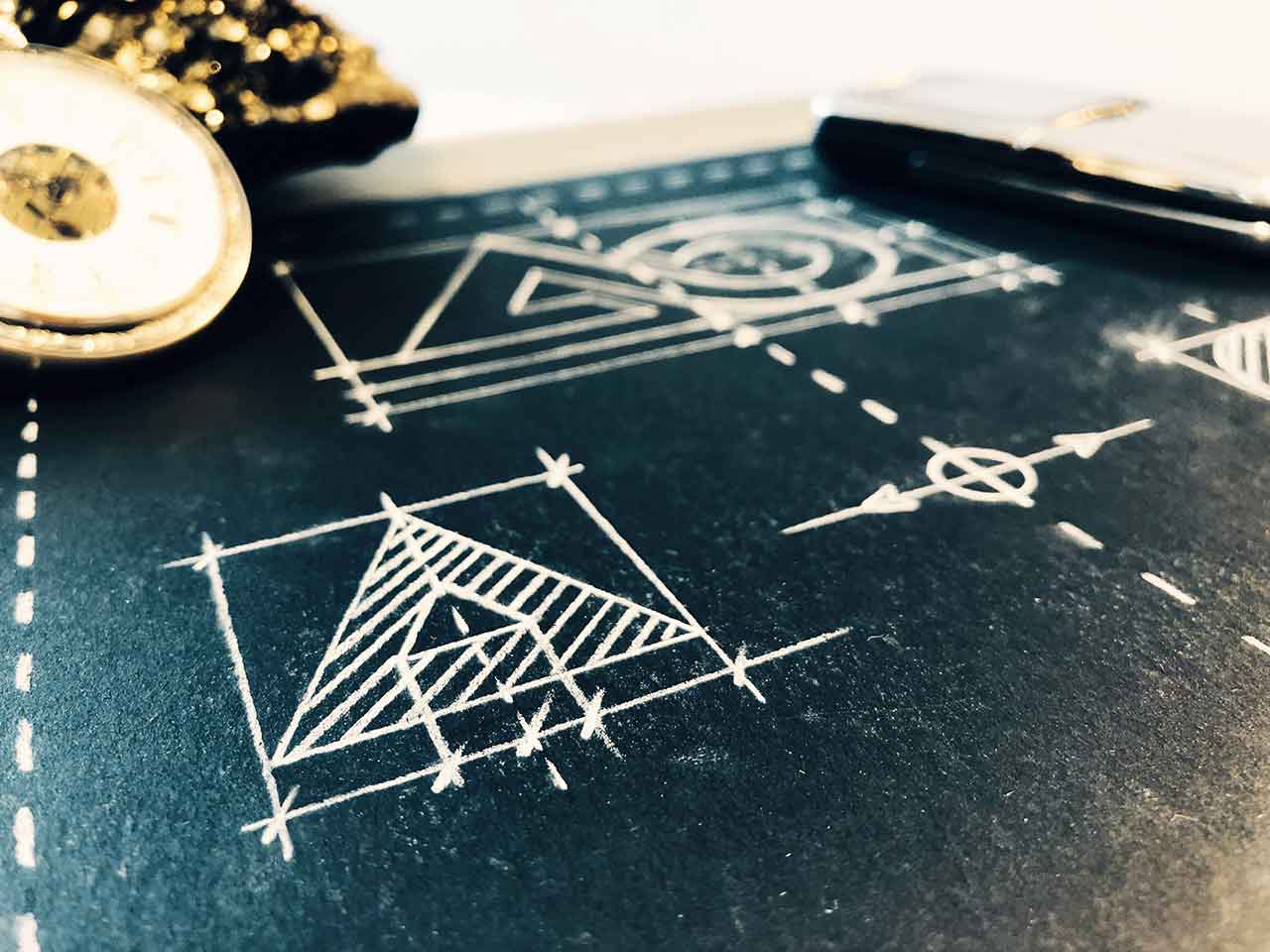
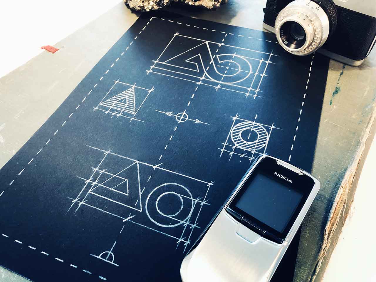
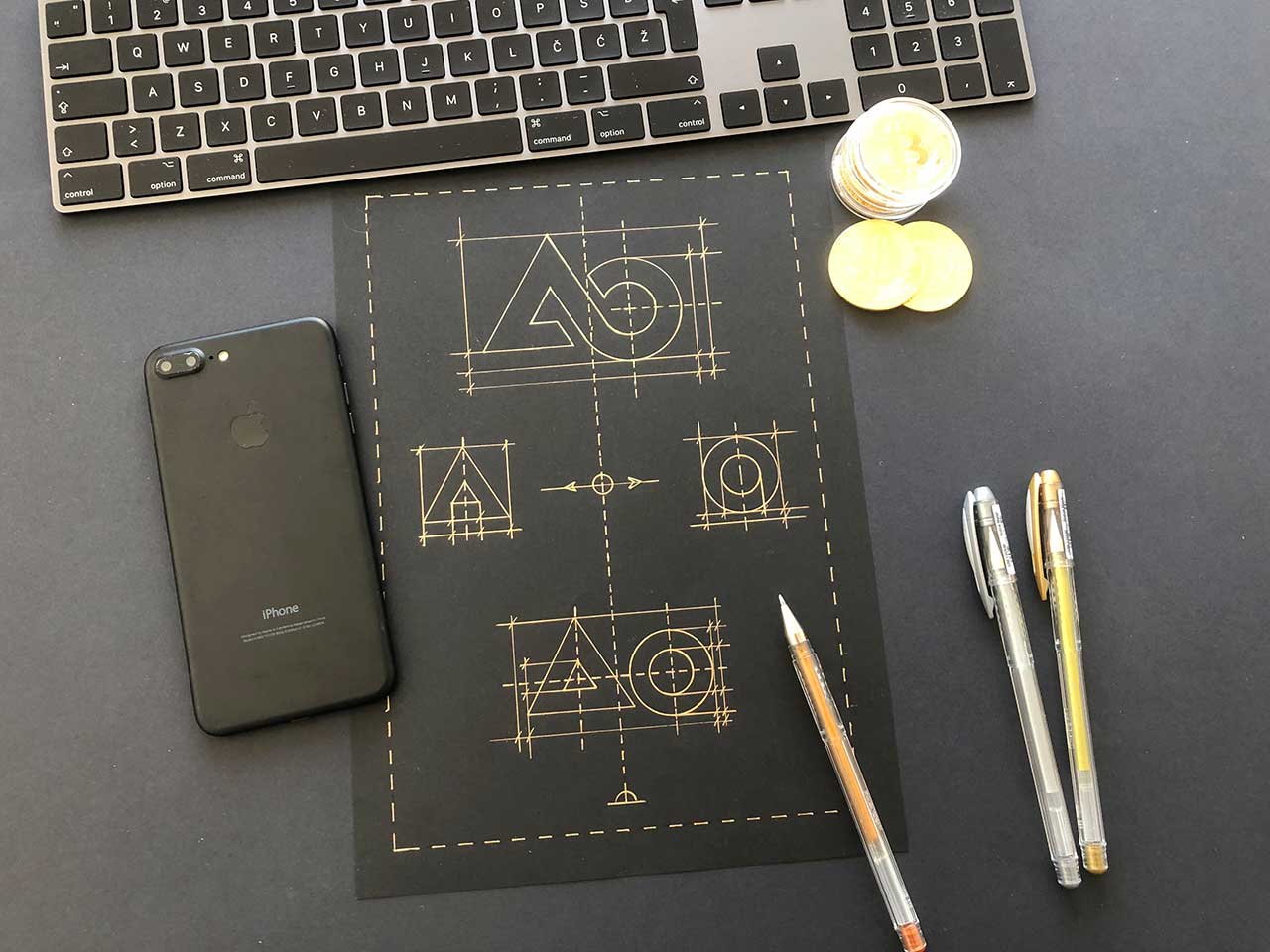
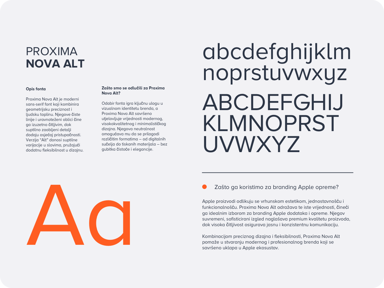
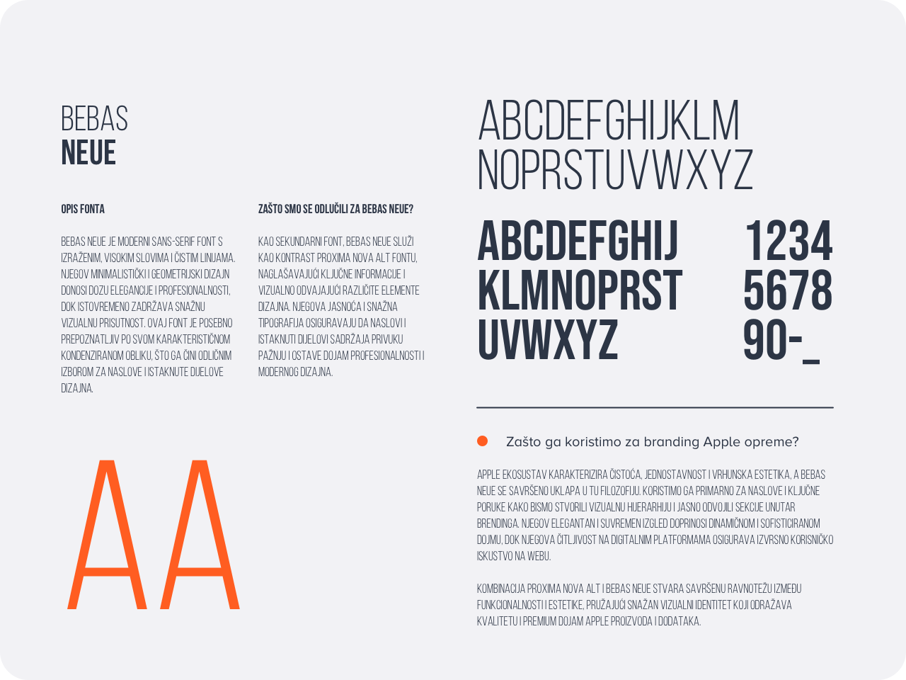
The combination of Proxima Nova Alt and Bebas Neue ensures a modern, professional, and structured visual identity, balancing readability with strong typographic contrast.
A carefully selected color palette reflects innovation, precision, and creativity, establishing a strong and recognizable brand presence across all applications.
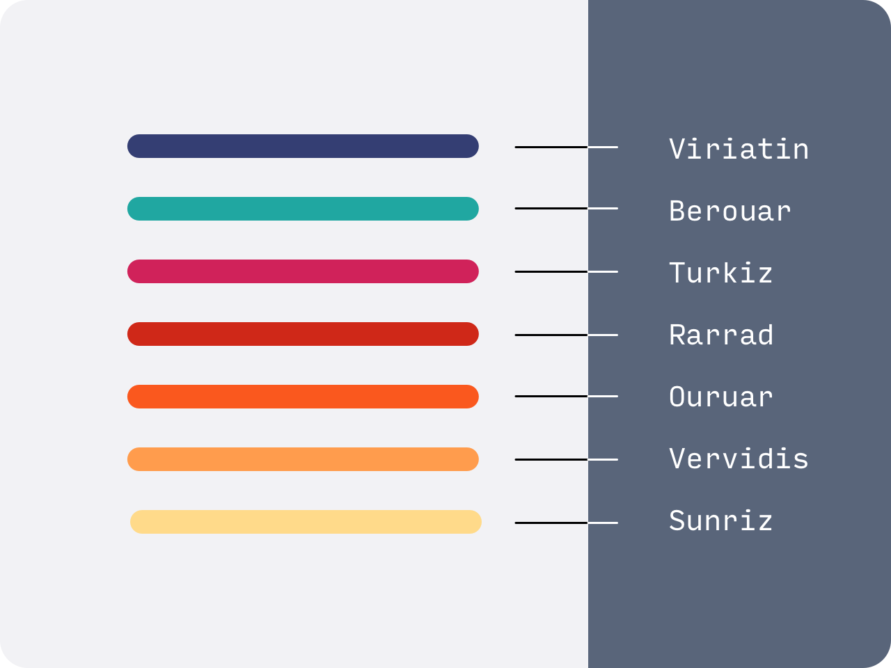
The visual identity of the Apple Oprema brand is based on a carefully selected color palette that reflects the brand’s core values: technology, innovation, precision, and aesthetic purity. Each color in the system has its purpose and contributes to the brand’s coherence across digital and physical applications.
• Viriatin (dark blue) – A symbol of stability, trust, and technological precision. This color emphasizes the brand’s seriousness and premium quality.
• Berouar (turquoise) – Brings freshness and modernity, reflecting the innovative spirit of technology.
• Turkiz (intense magenta) – Dynamic and bold, representing creativity and passion for design and aesthetics.
• Rarrad (red) – Highlights energy, determination, and the brand’s strong market presence.
• Ouruar (orange) – Symbolizes warmth, user-friendliness, and optimism, which are key aspects of the Apple Oprema brand.
• Vervidis (warm orange) – Connects technological precision with creative expression, ensuring balance in the visual identity.
• Sunriz (soft yellow) – Brings a sense of brightness and lightness, complementing the palette with a subtle yet effective finishing tone.
These colors create a distinctive visual identity for the Apple Oprema brand, emphasizing its connection to cutting-edge technology and minimalist design, in the spirit of Apple aesthetics.
>_ You liked this one?
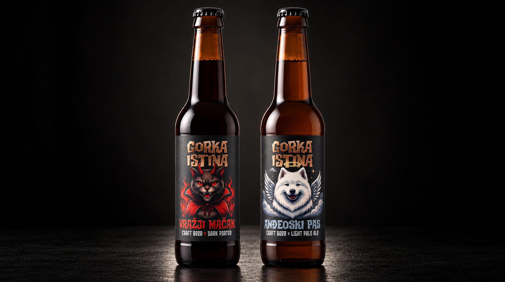
Every TruthHas TwoSides. Every TruthHas TwoSides. Family Hospitality, Reimagined. Client Gorka Istina Year of the project 2026 Project duration 2…
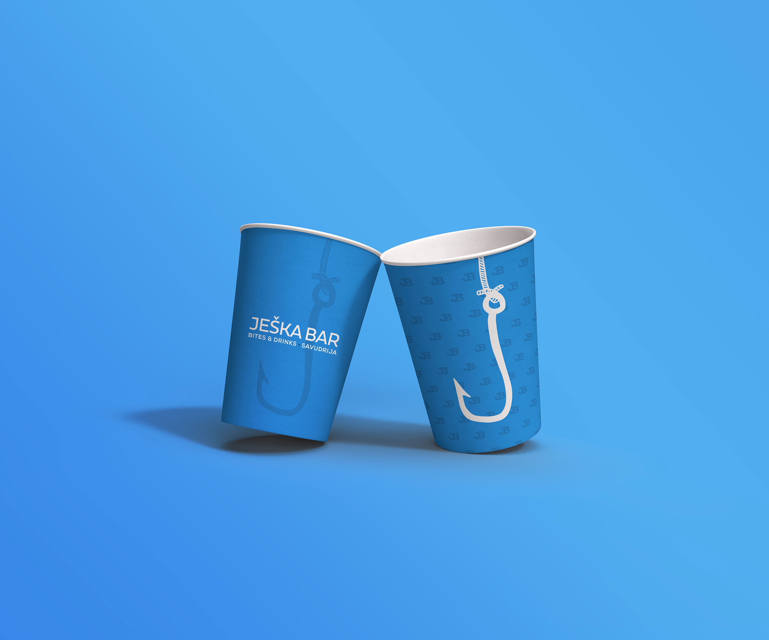
Where BitesTake theBait. Where BitesTake theBait. Family Hospitality, Reimagined. Client Ješka Year of the project 2026 Project duration 1 month…
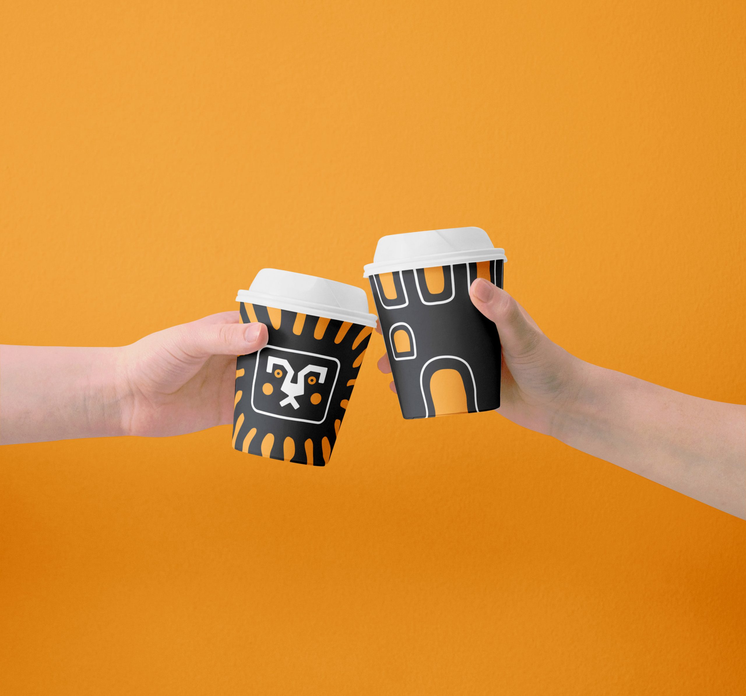
Where IstrianTradition GetsLoud. Where IstrianTradition GetsLoud. Family Hospitality, Reimagined. Client Veseli Umageži Year of the project 2026 Project duration 1…
Where Family Hotels BreakTradition. Where Family Hotels BreakTradition. Family Hospitality, Reimagined. Client Hotel Emaus Year of the project 2025 Project…
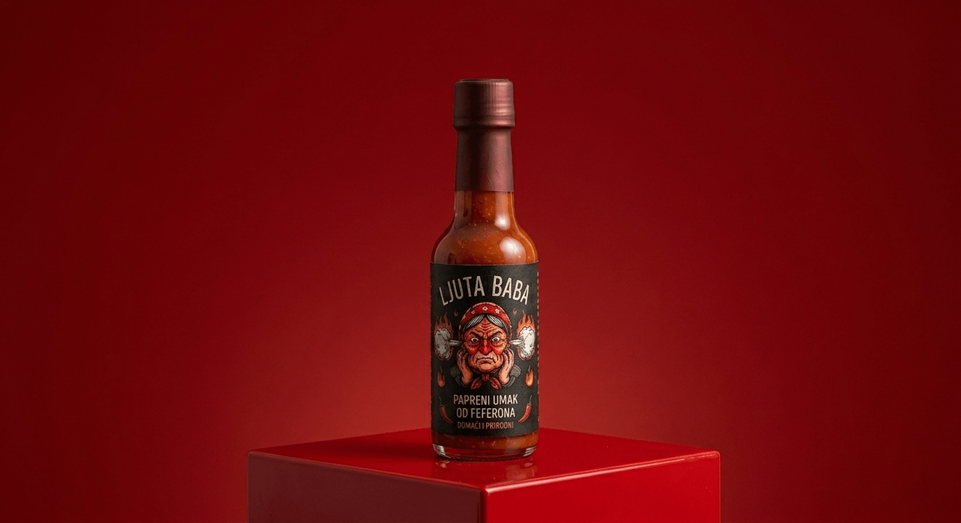
Crafted in Croatia.Made to burn. Where Family Hotels BreakTradition. Designing the attitude behind the spice. Client Ljuta Baba Year of…
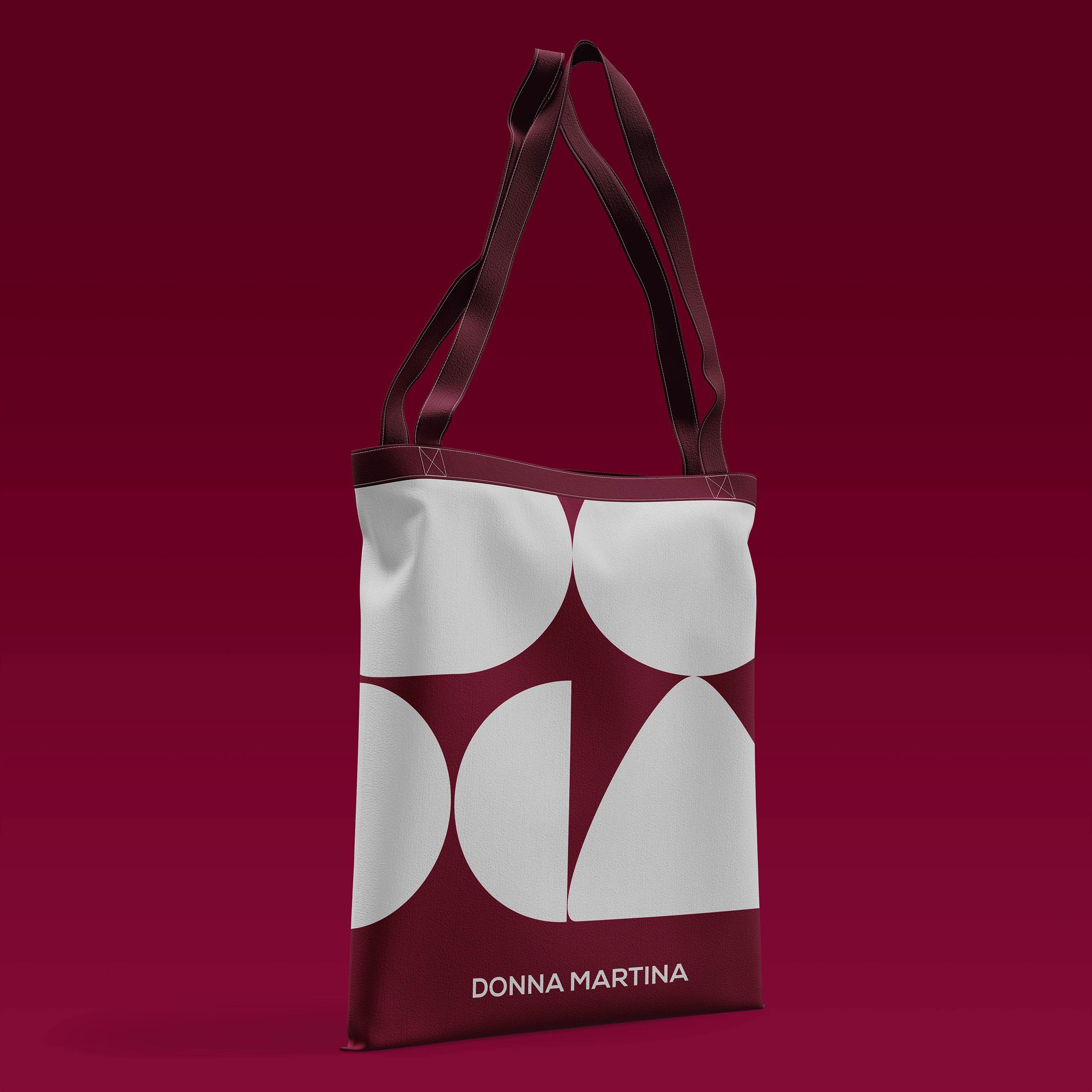
Rooted in Nature, Designed with Purpose Rooted in Nature, Designed with Purpose Capturing the essence of nature. Client OPG Donna…

High Games – branding, innovation & playfulness. High Games – branding, innovation & playfulness. Play. Innovate. Elevate. Client High Times…
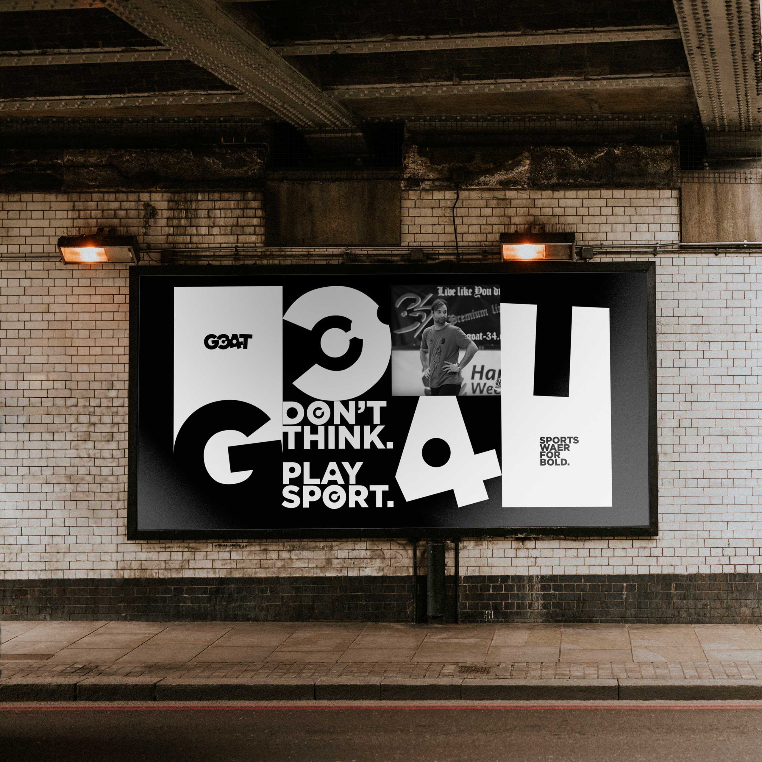
Goat 34 – identity, performance & sports excellence. Goat 34 – identity, performance & sports excellence. Don’t think. Play sport.…
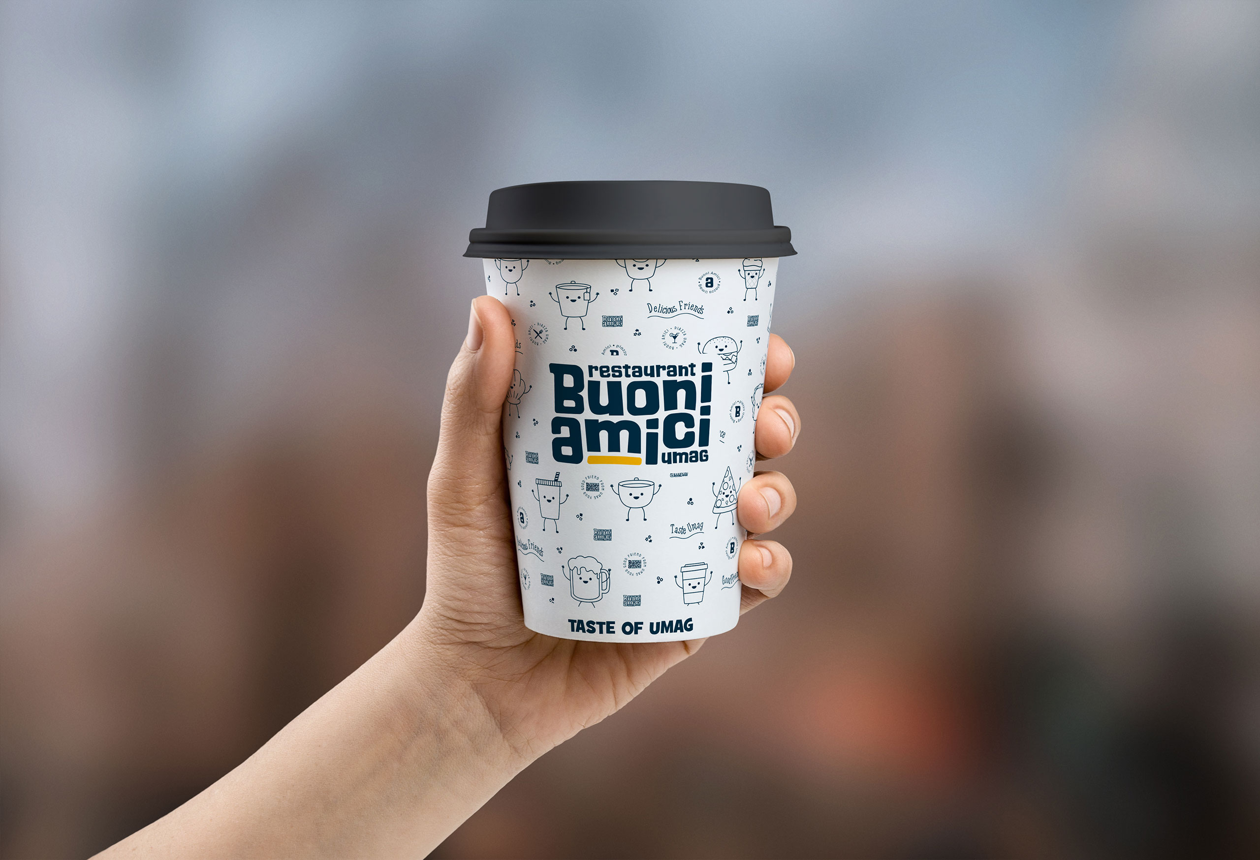
Restoran Buoni Amici – identity, tradition & culinary experience. Buoni Amici – identity, tradition & culinary experience. Where precision meets…
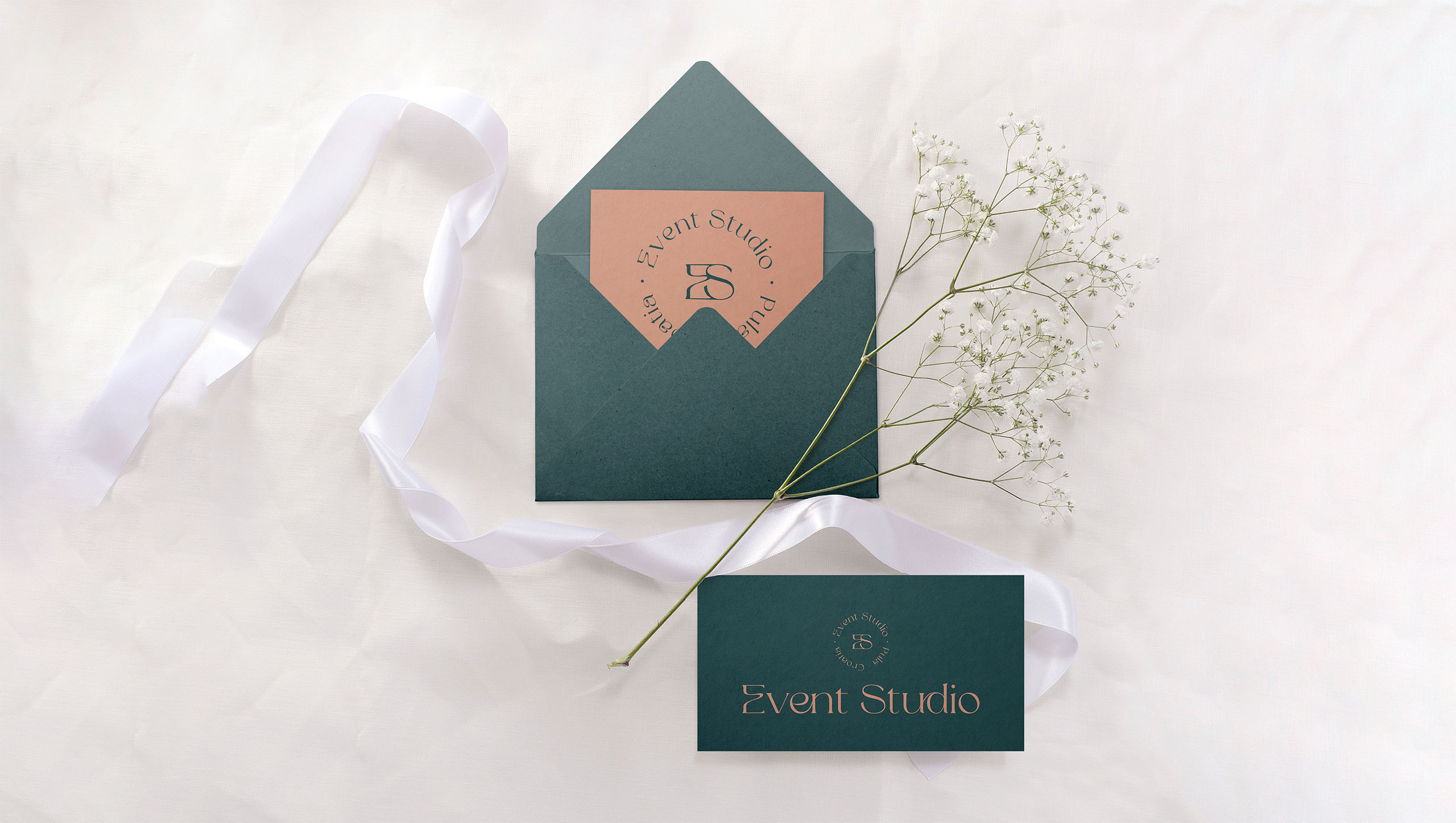
Event Studio – identity, experience & event storytelling. Event Studio – identity, experience & event storytelling. Where moments become memories.…
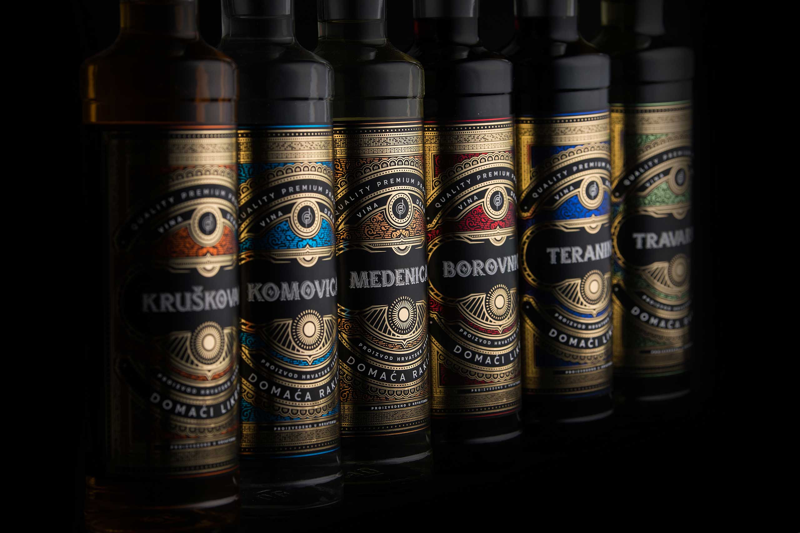
Vina Dean – identity, packaging & digital presence. Vina Dean Identity, packaging & digital presence. Where precision meets trust. Client…
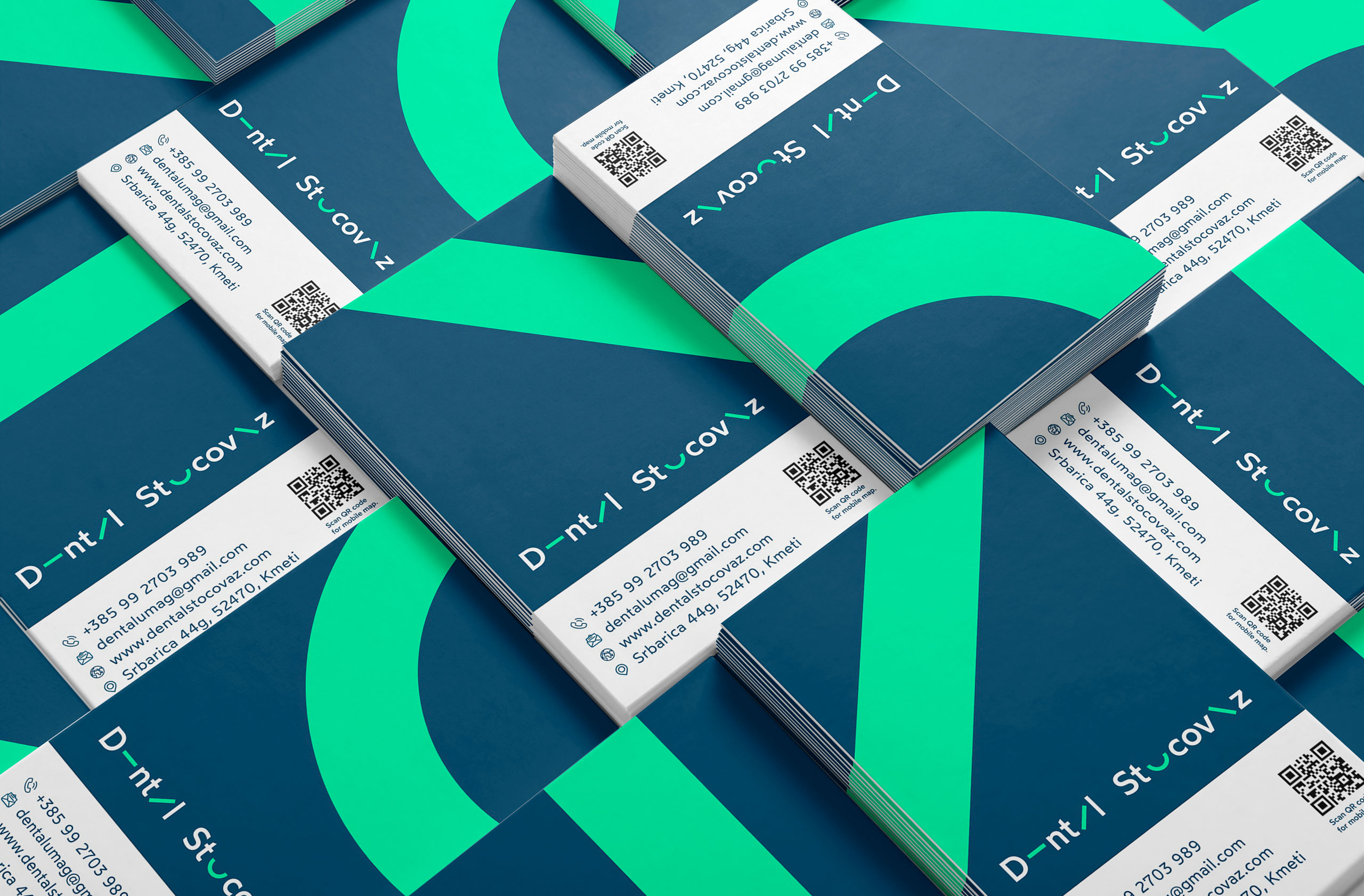
Dental Stocovaz – identity, design & digital clarity. Dental Stocovaz – identity, design & digital clarity. Where precision meets trust.…