Template za blog
Reading time: Date: Author: Branding is more than just a logo or a color scheme; it’s an emotional connection that…
At Aeon Studio, we believe in limitless possibilities. We craft innovative brand identities, seamless digital experiences, and designs that push the boundaries of creativity. From captivating branding and user-centric web design to unforgettable packaging and intuitive UX, we bring your vision to life in ways that resonate with your audience. Let’s create something extraordinary together. The possibilities are endless.
At Aeon Studio, we believe in limitless possibilities. We craft innovative brand identities, seamless digital experiences, and designs that push the boundaries of creativity. From captivating branding and user-centric web design to unforgettable packaging and intuitive UX, we bring your vision to life in ways that resonate with your audience. Let’s create something extraordinary together. The possibilities are endless.
Reading time:
Date:
Author:
In the ever-evolving world of visual communication, trends appear faster than ever. But not every new idea deserves a place in your brand’s identity or product design. The challenge isn’t staying on trend – it’s knowing which trends will bring lasting value and which are just temporary noise.
As a design studio working daily at the intersection of creativity, strategy and technology, we constantly analyze how new visual directions align with real-world business needs. Here’s what we’re seeing in 2018 – and how to approach these trends with a smart, selective mindset.
Minimalism is no longer a trend. It’s a standard. But it’s also evolving.
We’re moving beyond sterile white layouts and flat vector icons. In 2018, minimalism is about intelligent reduction, not visual emptiness. Think:
purposeful whitespace,
bold sans-serif typography,
subtle layering,
restrained color palettes with a single bold accent.
This approach makes interfaces cleaner, brands more confident, and communication more intuitive. It’s not minimal for minimal’s sake — it’s about letting content and meaning shine.
Worth implementing? Absolutely — when it serves clarity and intent.
Emerging as a rebellious reaction to polished interfaces, brutalism embraces raw, almost “unfinished” aesthetics: system fonts, oversized text, grid-breaking layouts, harsh contrast.
While its shock value grabs attention, brutalism is rarely user-friendly. It’s used best for art-driven campaigns, personal portfolios, or brands intentionally seeking to challenge visual norms.
Worth implementing? Selectively. Not ideal for corporate branding or UX-driven platforms.
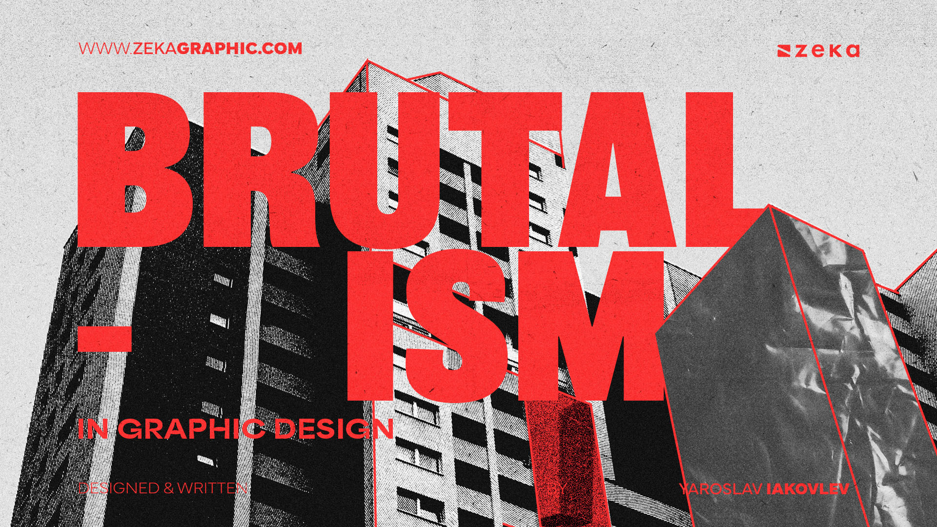
Image borowed from: ZEKA
A few years ago, gradients felt dated. But thanks to brands like Instagram, Spotify and Stripe, gradients are back – with purpose.
In 2018, we’re seeing:
dynamic duotones,
layered mesh gradients,
background transitions used to support storytelling.
When applied with restraint and contrast, gradients can add depth, warmth, and emotional impact. Overuse, however, can lead to clutter and visual fatigue.
Worth implementing? Yes – especially in hero sections, icons, or visual branding elements.
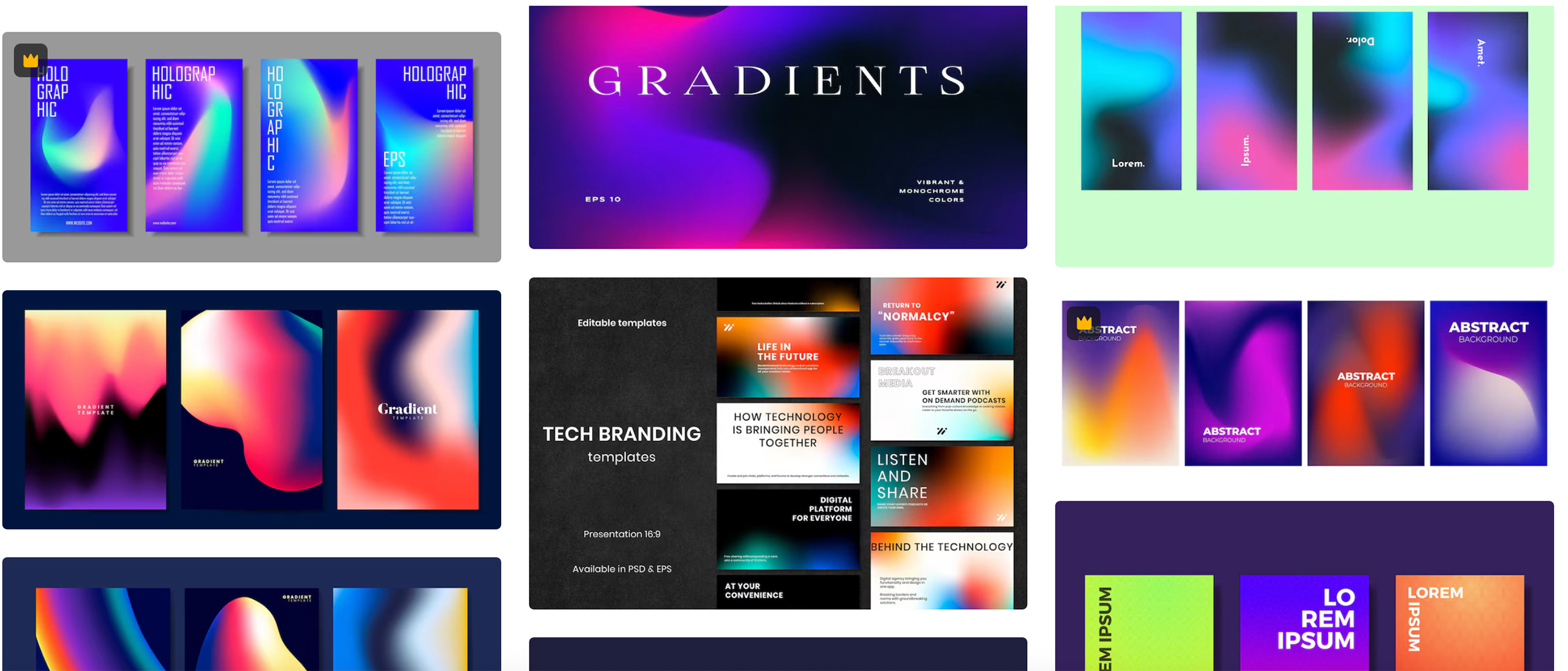
Screenshot from: FREEPIK
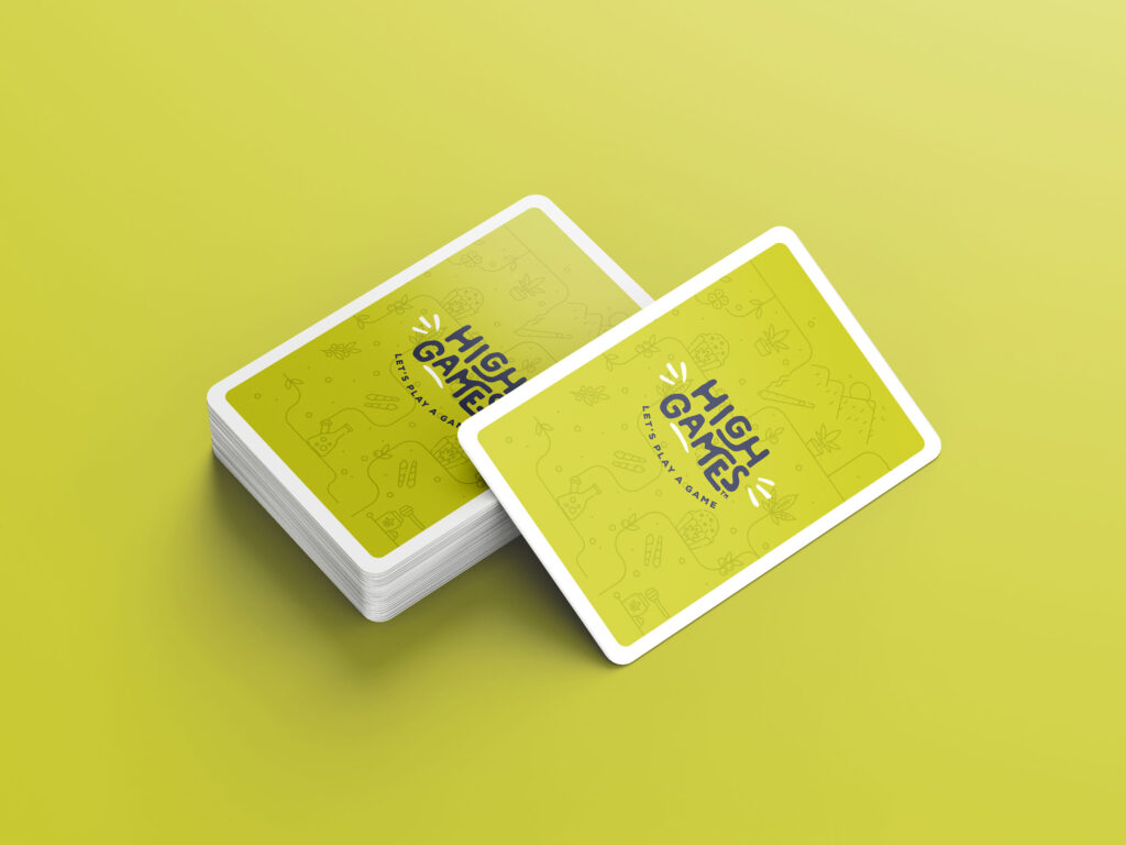
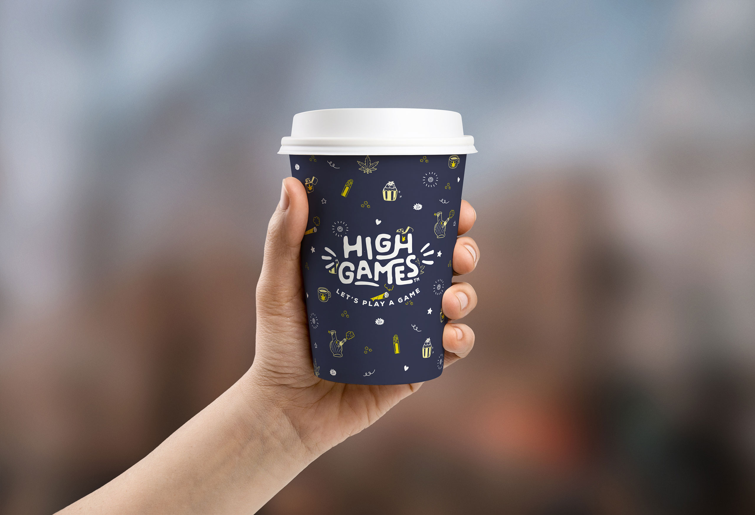
We’re witnessing a sharp rise in brands commissioning bespoke illustrations — hand-drawn characters, expressive line art, or abstract geometric compositions — instead of relying on generic stock photos.
These visuals humanize brands, tell stories faster than text, and offer instant recognizability. They’re especially effective in landing pages, onboarding flows, and social media content.
Worth implementing? Definitely. It’s one of the strongest ways to differentiate in 2018.
Animation is no longer limited to splash screens. In 2018, motion is used to:
guide attention,
confirm actions,
smooth transitions,
add delight.
Think of toggles that bounce slightly, buttons that “press” realistically, or content that fades in as you scroll. These microinteractions elevate user experience — when used sparingly and meaningfully.
Worth implementing? Absolutely — if performance and accessibility are considered.
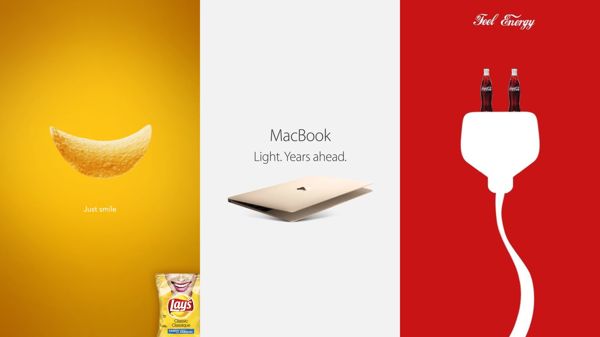
Typography has become a playground. Designers are stretching, distorting, layering, and animating type in ways never seen before.
While exciting, experimental type must never compromise readability. In branding, creative typography can convey personality. On UI-heavy platforms, stick to clarity.
Worth implementing? For creative headlines, editorial pieces, or campaigns — yes. In body text or UI? Use with extreme caution.


At Aeon Studio, our process begins with listening — not just to the market, but to the client’s needs, their audience, and their long-term goals. We don’t adopt trends for aesthetic reasons alone. We evaluate every visual direction against three simple questions:
Does it support clarity?
Does it align with the brand’s values?
Will it still feel relevant in a year?
If the answer isn’t a confident yes to all three, we leave it on the shelf.
>_ You liked this one?
Reading time: Date: Author: Branding is more than just a logo or a color scheme; it’s an emotional connection that…
Lorem ipsum dolor sit amet, consectetur adipiscing elit. Sed do eiusmod tempor incididunt ut labore et dolore magna aliqua. Ut…
Graphic Design & Branding IDA Awards, 2CA Awards Graphic Design & Branding IDA Awards Website UI & Design Croatian Tourist…
Studio LOAR Studio LOAR Ponuda 55-0824 Klijent Studio Loar Datum ponude 29.08.2024. Trajanje projekta 3 mjeseca Uz papirnatu verziju, ponuda…
Branding Website We reveal the soul without youeven seeing it. We reveal the soul without you even seeing it. Solution…
Lorem ipsum dolor sit amet, consectetur adipiscing elit. Sed do eiusmod tempor incididunt ut labore et dolore magna aliqua. Ut…
Lorem ipsum dolor sit amet, consectetur adipiscing elit. Sed do eiusmod tempor incididunt ut labore et dolore magna aliqua. Ut…
Lorem ipsum dolor sit amet, consectetur adipiscing elit. Sed do eiusmod tempor incididunt ut labore et dolore magna aliqua. Ut…
Inistria – impactful brand identity that inspires trust. InistriaBrand that inspirestrust. A healthy and green approach, driven by perfection. Client…

Reading time: Date: Author: In the ever-evolving world of visual communication, trends appear faster than ever. But not every new…

Reading time: Date: Author: When Aeon Studio was founded, the vision was clear from the very beginning — to offer…
One of the firstweb stores in Croatia. One of the first web stores in Croatia. Quality was always our middle…