The Future of Branding: How AI and Human Creativity Work Together
Reading time: Date: Author: Introduction Branding has always been about emotion, storytelling, and connection. But in 2025, the rules of…

At Aeon Studio, we believe in limitless possibilities shaped by clarity, balance, and refined simplicity. Our identity is built on principles of purpose, discipline, and meaningful design — values that guide every project we craft. From distinctive branding and thoughtful digital experiences to refined visual systems, our work reflects the philosophy we live and create by. Explore the essence of our brand, discover the structure behind our logo, and see how our vision comes to life.
View our brand →
Reading time:
Date:
Author:
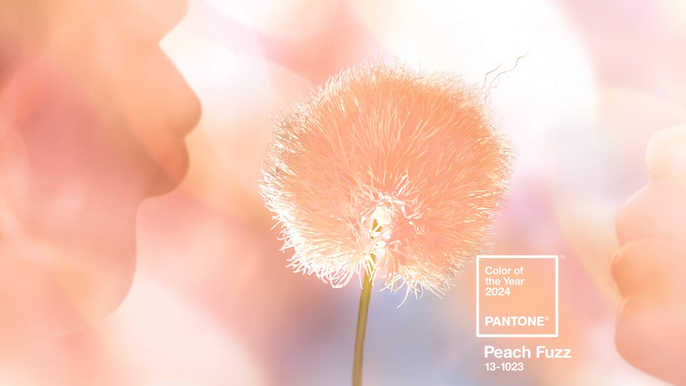
Each year, a single color captures the cultural spirit of the moment. For 2024, Pantone selected Peach Fuzz — a soft, warm hue that reflects community, tenderness, and optimism. But beyond symbolism, how can this color be applied in branding and design today?
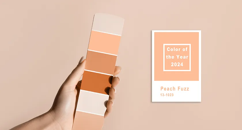
The Psychology of Peach Fuzz:
Warmth and approachability
A sense of comfort and connection
Gentle optimism in a complex world
How to Use It in Design:
Digital Media: Buttons, CTAs, highlight gradients in UI/UX.
Branding & Print: Packaging accents, textured backgrounds, subtle overlays.
Marketing Collateral: Lifestyle imagery with peach tones, photography filters, typography highlights.
Aeon Studio Tips:
Combine Peach Fuzz with neutral palettes (grays, off-whites) for timeless balance.
Pair with bold contrasts (teal, navy, emerald) to create striking modern visuals.
Use sparingly as an accent in corporate design — or boldly as a hero color in lifestyle branding.
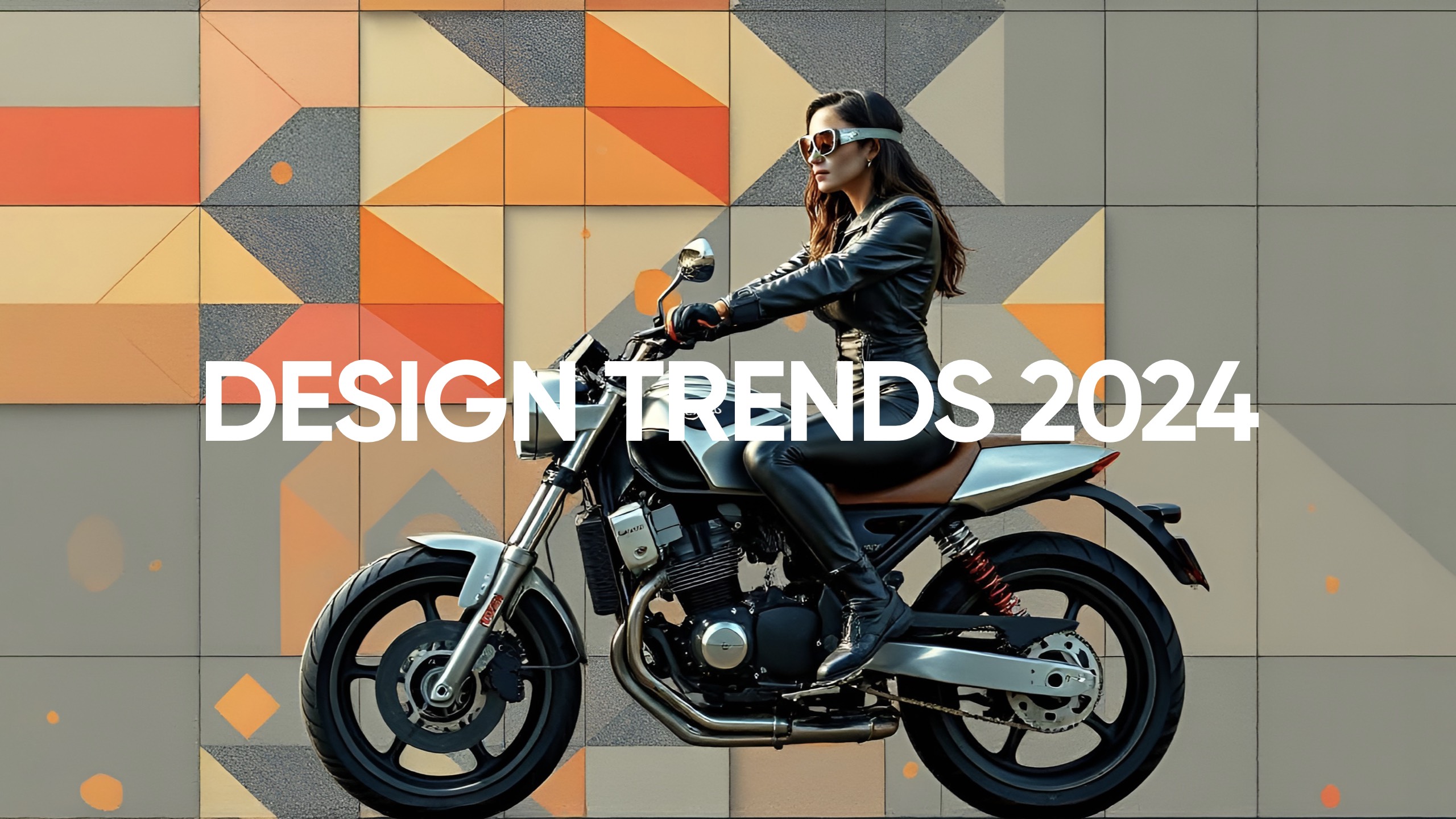
2024 is less about chasing “what’s new” and more about redefining the familiar. For brands, the opportunity lies in balancing modern functionality with emotional resonance. These trends are not just styles — they’re strategic choices for staying relevant.
>_ You liked this one?

Reading time: Date: Author: Introduction Branding has always been about emotion, storytelling, and connection. But in 2025, the rules of…

Reading time: Date: Author: Introduction In 2024, sustainability moved beyond being a buzzword — it became an industry standard. From…
Reading time: Date: Author: Aeon Studio on Sketch Blog One of our proudest moments in 2024 was being featured on…
Reading time: Date: Author: Introduction Great design doesn’t happen by accident. Behind every successful brand is a deliberate and deeply…
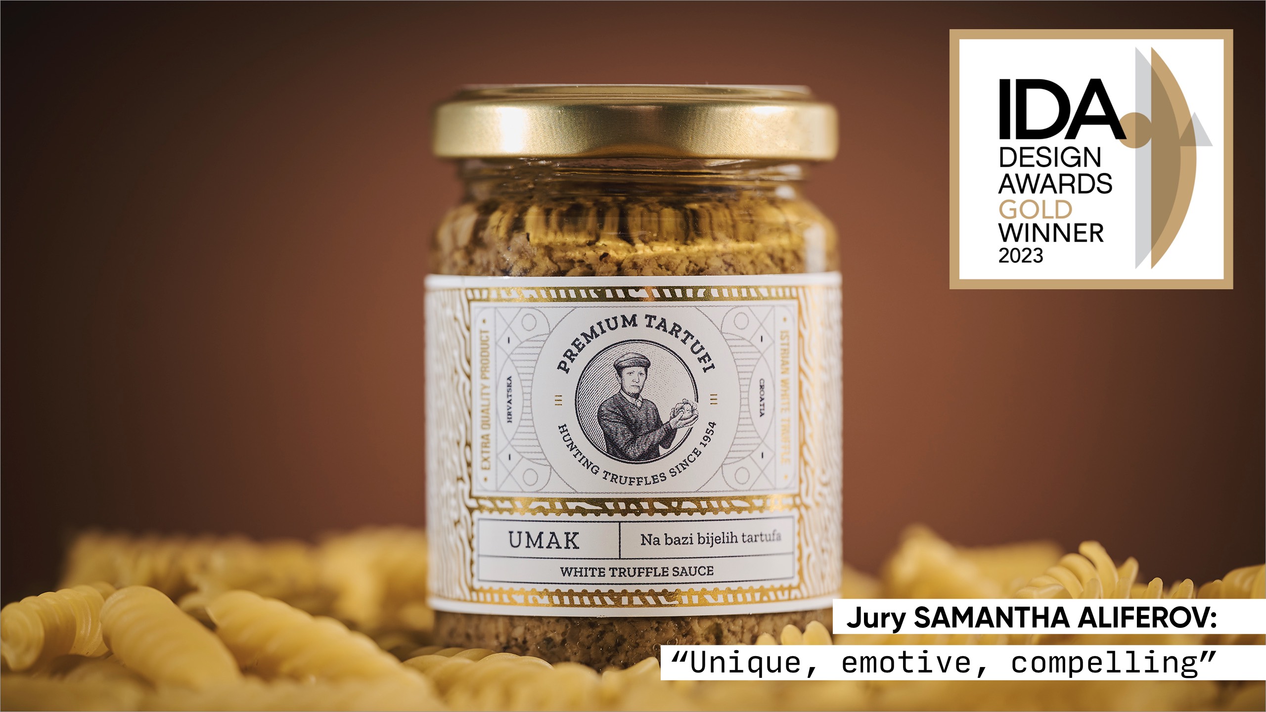
Reading time: Date: Author: Award-Winning Design – Premium Tartufi at the International Design Awards At Aeon Studio, design has always…
Reading time: Date: Author: Color of the Year 2024: Peach Fuzz — Why It Matters and How to Use It…
Reading time: Date: Author: In a world where design and technology constantly redefine the rules, what felt fresh in 2018…

Reading time: Date: Author: When Aeon Studio was founded, the vision was clear from the very beginning — to offer…

Reading time: Date: Author: As businesses evolve, so do their audiences, services, and ambitions. Yet many brands find themselves stuck…